For this college project, I had to create an accommodation app, which seemed simple at first but held more complexity beneath the surface. It involved understanding not just design principles but also user psychology, technical feasibility, and the nuances of the accommodation industry.
Case Study
Web App/Landing Page
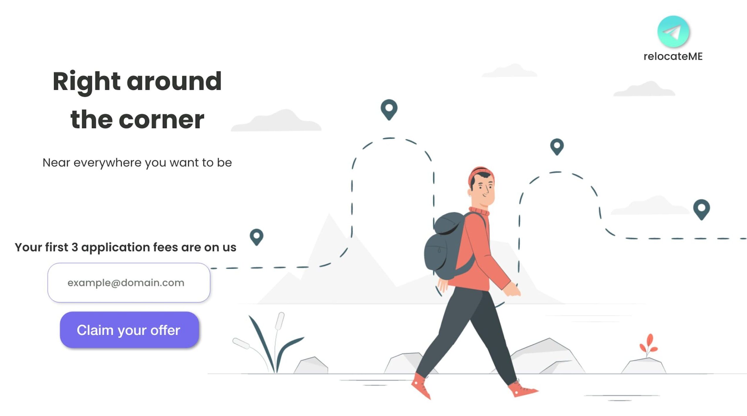
relocateME
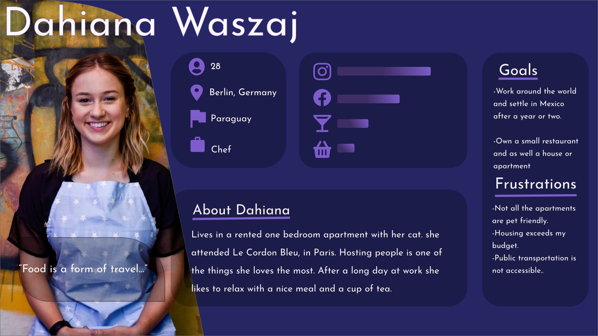
Finding the Perfect Fit
Extensive research became the cornerstone. I analyzed market trends, surveyed potential users, and identified their pain points. Crafting detailed user personas was crucial to understand their diverse needs. Task flows were mapped out to ensure that the app could serve as a one-stop solution.
Brushing on the Creativity
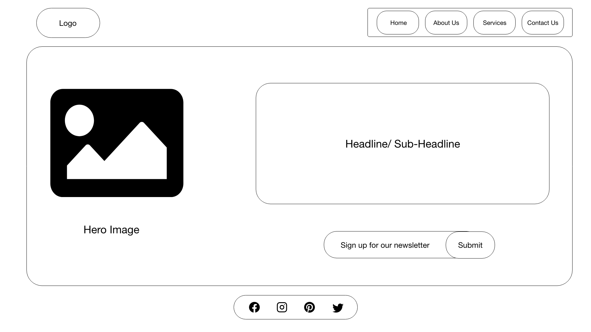
Ideas were brainstormed, and wireframes were drafted. The landing page design was meticulously created, keeping user experience and branding in focus. This stage demanded striking a balance between creativity and practicality.
Wireframes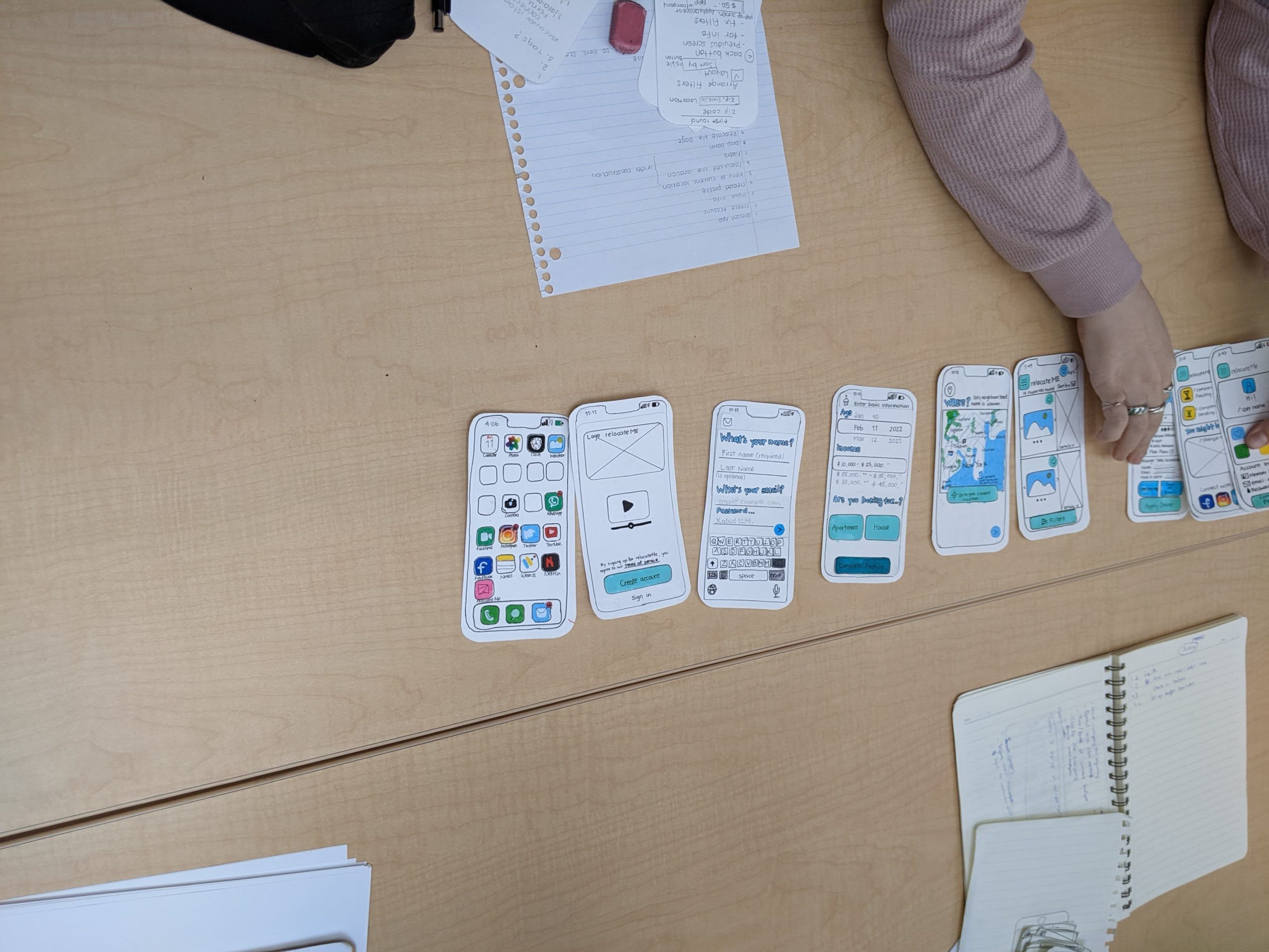
From Concept to Clickable
The transformation from static designs to a clickable prototype was intriguing. The complexity lay in making sure that every interaction felt intuitive, ensuring a seamless experience. Adobe XD proved invaluable in bringing our ideas to life.
Adobe Xd Prototype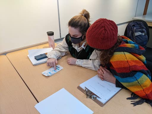
Perfecting the Polish
User testing was where the real adventure began. Complex scenarios and real-time user feedback highlighted areas for improvement. It was a continuous process of refinement, with iterations becoming more polished, one after another.
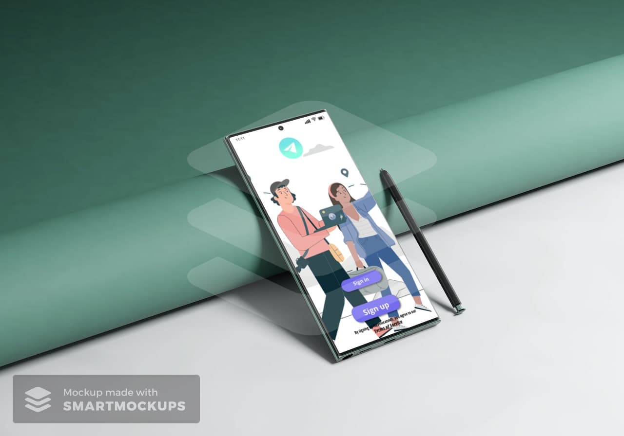
Polished and Ready to Shine
The project culminated in an app that not only met the initial assignment but surpassed it. It had evolved from a mere concept to a fully functional, user-centered solution. From complexities to simplicities, it was a journey of learning, innovation, and perseverance.
See Project Landing Page