BEYOND skincare brand's design system emphasizes brand identity, sustainability, and consistency in color, typography, and user experience.
Case Study
Design System
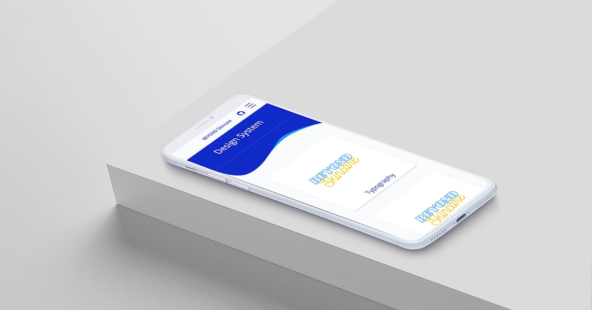
BEYOND Skincare
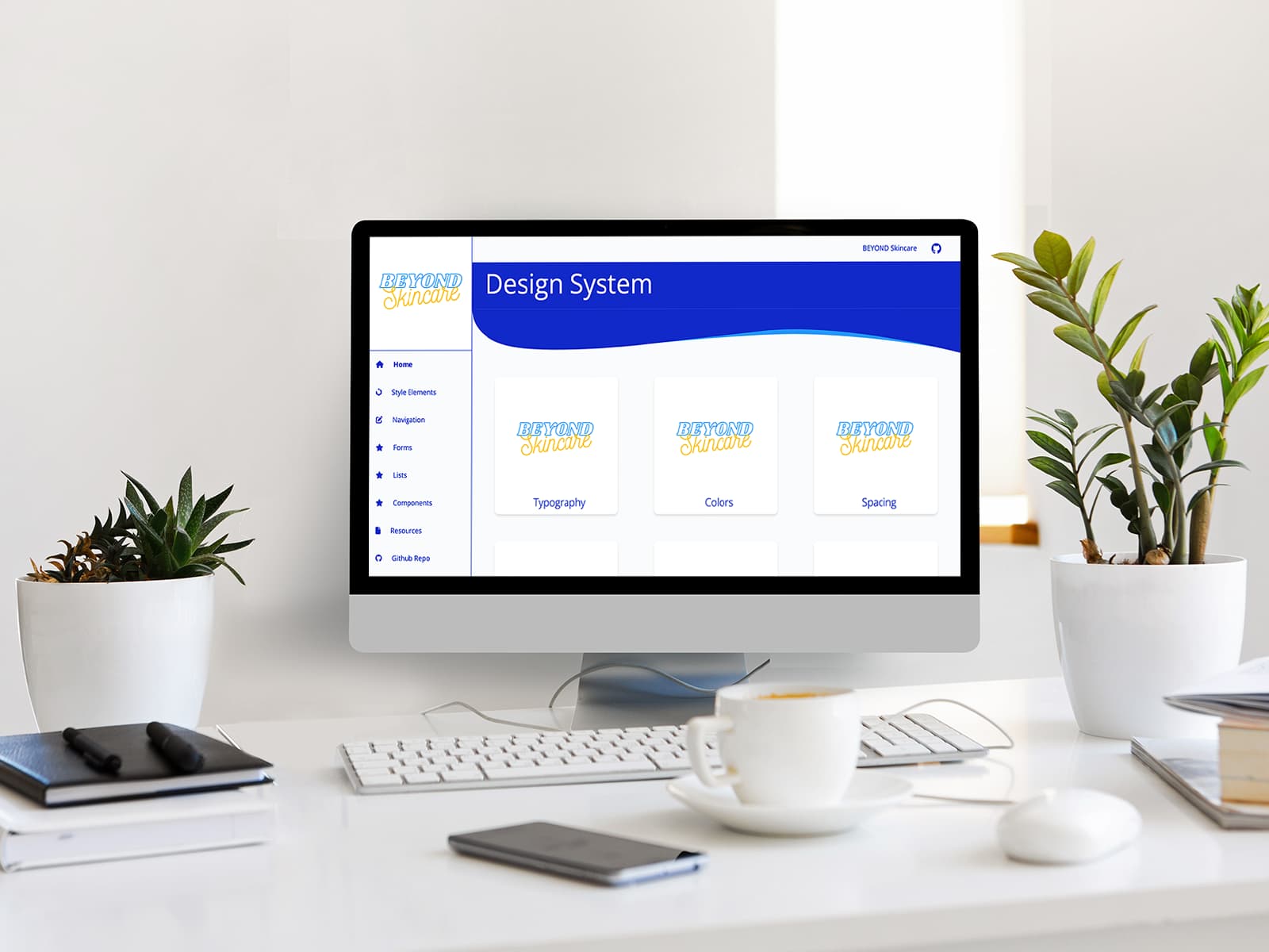
Define the Scope
In this step, I identified the needs and goals that the system will serve the target audience, and the elements and components required to meet the user needs and brand identity.
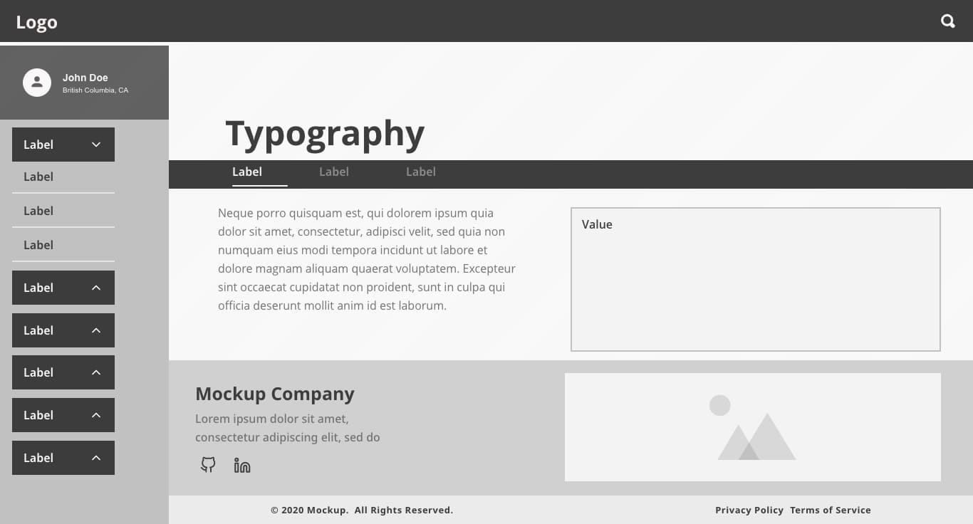
Wireframes
I used Adobe Xd to create the layout of mobile and desktop screens for the design system and the sample website based on the mood board I put together to convey the overall look, feel, and style.
Xd Wireframes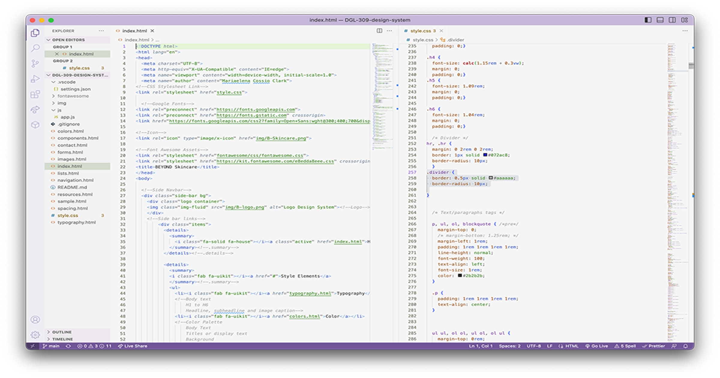
Build, Build And Keep Building
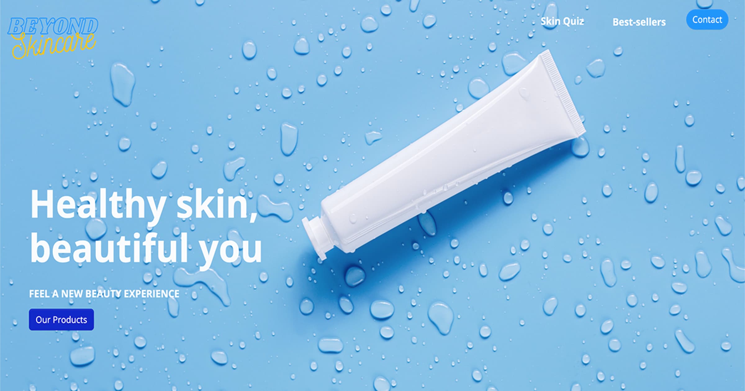
During the development process of my sample website, I utilized HTML for building and CSS for styling to create pages that showcased the guidelines and format of the components and layout. Ultimately, I displayed the finished product on the sample website.
Github Repository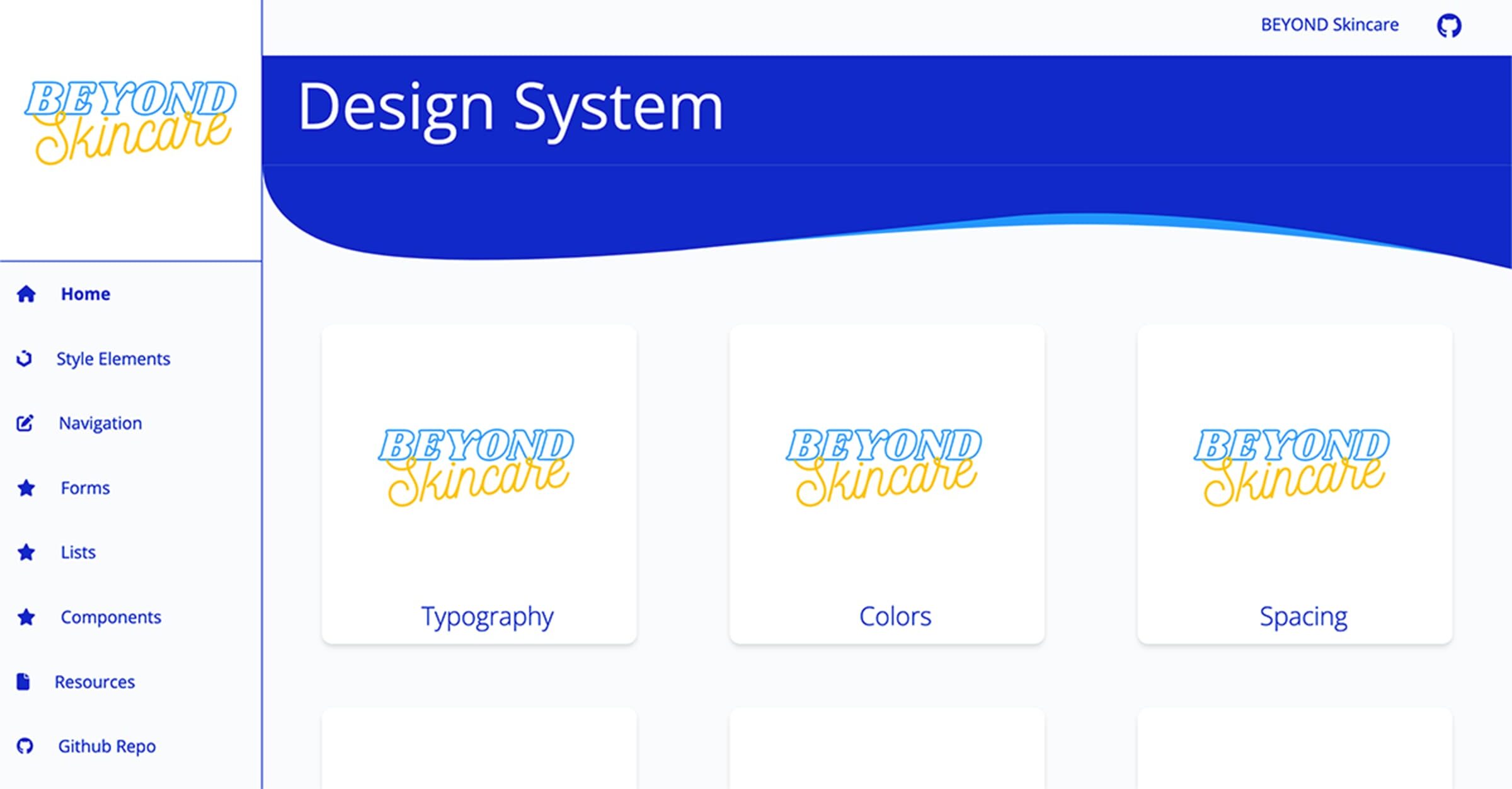
Test, Refine + Implement
The final step was to test the usability and functionality with tools such as GTmetrix and WebAim in order to identify the weak points to improve and refine them.
Challenges I faced
Building a design system is not a one-time process, it requires continuous iteration and refinement. Through regular meetings and walk-throughs with my peers and instructor, I gained a fresh perspective on how to approach and provide feedback on our respective projects.
See Project